
Strike Graph is a software as a service (Saas) company that deals in cyber security compliance (I had no idea that was even a thing before this project).
Strike Graph wanted to lighten the load on their customer success team by improving the intuitiveness of their application and to introduce ways for users to learn how to use the software inside of the application.

Strike Graph
My Role: Moderator | Researcher | Writer | Designer
This is where UX comes in
What Went Down:
In order to get the best information, I worked on a team to gather and synthesize primary research (Cognitive Walkthroughs and Contextual Inquiry). Once the data was disseminated, we split up to define what prototypes would best serve Strike Graph’s goals.
Key Deliverables: Research findings and prototype plan | Interactive prototype
Tools: Figma | Zoom | Google Docs
Methods: Cognitive Walkthrough | Task Analysis | Contextual Inquiry | Design Ethnography | Affinity Diagraming


What Came Up:
I solved the in app learning problem by building two user stories and subsequent scenarios that would inform the prototype and give it depth. The first user flow fixes issues related to cognitive overload which prevents the ability to learn. The second user flow fixes the need to navigate away from the site, either by way of the help center or a phone call to customer success.
PROJECT OVERVIEW
PROBLEM
Product onboarding and compliance education exist primarily outside of the app with customer service reps. Strike Graph would like to reduce the hand-holding required by their Customer Success team to help their users complete their required tasks and understand how to use the product.
SOLUTIONS
Reduce overwhelm by allowing immediate interaction with crucial tools
The original dashboard is not interactive. The user has a large visual representation of everything that needs attention including what has been satisfied without the ability to do anything with the information making it overwhelming to view. ‘
Reduce cognitive load through way-finding improvements
Giving the user a way to get to where they last completed an action will help reduce the cognitive load involved with searching from page to page.
Inform the user on how to perform tasks in key areas without needing to leave the site
Give infrequent users of the software actionable tips in areas where users need to complete important tasks.
Phases: Identify, Prototype, Evaluate
COGNITIVE WALKTHROUGH
Key tasks supplied by the client were performed and graded on a pass-fail scale according to four usability principles. Four questions were considered while walking through the tasks:
Will the user try to achieve the right outcome? (Mental Model)
Is the correct action visible? (Visibility/Hierarchy)
Is there a clear connection between the control and resulting action? (Mapping)
Is there sufficient and/or appropriate feedback?
Phase: Identify
Pain points identified in this phase:
Cognitive overload
Poor hierarchy of important actions
CONTEXTUAL INQUIRY
If you are interested in seeing the full protocol, you can view it here.
Phase: Identify
Primary users of Strike Graph were interviewed in the style of Contextual Inquiry with the intent to accomplish these goals:
Learn more about how Strike Graph is integrated into the users workflow and environment (context)
Gain insights around intuitiveness of current website
Uncover opportunities and pain points of current website (consistency, visibility, feedback)
Pain points discovered in this phase:
Significant learning of the software needs to happen before the user can complete any work.
Certain colors that indicate necessary functionality are inaccessible to color blind people.
There is too much consistency across the platform, making it difficult to determine where the user left off.
Data from the interviews was collected in Figjam and organized it by tasks outlined in the protocol. Three team members observed the session, taking notes on visual cues, spoken narrative and quotes. One team member provided technical support and I moderated the interviews.
DATA COLLECTION
Phase: Identify
Skills demonstrated here:
Collaboration within a team.
Organization of large amounts of data.
Task delegation by proficiency.
SYTHESIS
Decisions for prototyping were informed by user stories and subsequent scenarios in order to keep the primary users in mind and to give the prototype depth. You can find the full findings report here.
User Story 1:
As a seasoned professional working in the compliance arena, I want to know what my highest priority task is so that I can complete my work efficiently.
User Story 2:
As a member of the legal team, I want to understand what my role is as I interact with Strike Graph so that I can keep up with my company’s compliance goals.
Phase: Evaluate
Insights:
Scenarios are immensely helpful in understanding how a user would interact with this complex software.
PROTOTYPING


User Flow 1
User Story: As a seasoned professional working in the compliance arena, I want to know what my highest priority task is so that I can complete my work efficiently.
User Flow 2
User Story: As a member of the legal team, I want to understand what my role is as I interact with Strike Graph so that I can keep up with my company’s compliance goals.
I got a good idea of where I wanted to go with the interactive prototype through sketching out low-fidelity wireframes.
Sketching Insights
Although I am working on my sketching skills, even the roughest outline was helpful before jumping into Figma
A goal of mine is to refine my hand drawing abilities to communicate more clearly on a team.
Insights
The original dashboard was purely visual and took up a majority of the screen which forced the user to dig through the site to find where to start.
An interactive dashboard with a clickable and scrollable list, broken up into specific categories serves as a way for users to identify what action needs to happen first.
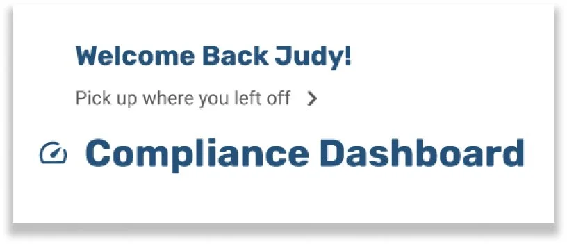
Insights
This simple piece of navigation, “pick up where you left off” will help users to toggle between the dashboard while keeping the place in another area of the site.
The navigation also helps the user return to what they were working on when logging in at the beginning of their work day.
Explanation
This is an example of where a user could go after clicking “pick up where you left off”
Displayed here are the specific risks that a user “owns”
When a risk is clicked, it takes the user to the page where they need to take action.
User Flow 2 Continued
Explanation
The user will ultimately get to this screen, where the key task is completed.
In app learning is facilitated by tool tips that guide the user through the process.
This screen represents what happens when each tip is revealed. If the user does not want to see the tips, they can close the initial overlay (Hi Erin!) and get right to work.
Check out flow 2 here!
Check out flow 1 here!
Phase: Application
SUMMARY
Phase: Identify, Prototype, Evaluate
Problem:
Strike Graph wants to alleviate the the work load placed on the Customer Success Team by incorporating in app and in workflow learning.
Solution:
Reduce cognitive load by making the entry point interactive so that the user doesn’t have to go digging for the information represented in the dashboard.
Allow the user to figure out how to use the software without needing to leave the site. This was accomplished by tool tips in key action areas.
Closing Thoughts
This was an intimidating project for me because the content involved is vast, dense, specialized and sensitive. The biggest take away was not a specific UX principle or method but the idea that the whole UX package is helpful whether I understand the inner workings of a company or not. All I need to know is what problem they are trying to solve, and I can take it from there.
What happened in between:
A cognitive walkthrough revealed opportunities to improve the visibility and hierarchy so that the user doesn’t have to think harder than they already are to do their job.
Contextual Inquiry revealed exactly where the cognitive load was exacerbated which was right in the beginning of a work flow and at key action areas
Prototyping helped the client see the difference a few usability upgrades could do for their company.