
A Traveled Path Homes

My Role: UX/UI Design, UX research
A Traveled Path Homes is a lodging startup, offering a solution to traveling professionals who are challenged with finding safe, affordable and convenient lodging to accommodate their mid-term rental needs. A Traveled Path Homes is looking to solve a common problem amongst all traveling professionals– competing with those seeking vacation rentals, and securing safe and secure longer-term housing.
This is where UX comes in
Over the course of three weeks, I worked on a four person team to help our client by designing a fully-interactive prototype of a booking platform. Our primary user groups were traveling professionals or “renters” and property owners, referred to as “owners”. Our goals were to find out what each group wanted from a booking platform that catered exclusively to traveling medical professionals and educators. In this project, every team member participated in research and I had the strongest hand in designing the renter booking flow. I also contributed the color pallet and font choice to the design system.
Methods: Competitive analysis | deep-dive research | user interviews | user flows | information architecture | hand-sketching | Kano Analysis | wireframes | usability testing | high-fidelity interactive prototyping.
Deliverables: High-fidelity prototype | annotated screens | next-step recommendations.
Tools: Figma | Figjam | Google Suite | Sketchbook
A Traveled Path Homes renter booking flow
Sneak Peak>>>>
PROJECT OVERVIEW
Problem:
The problem our client is trying to solve is a shortage of mid-term housing for traveling medical professionals and educators. They need a software as a service platform to show proof of concept to investors in order to secure funding. The initial problem for us to solve was to find out what hypothetical users of A Traveled Path Home’s platform might need from it. The renter’s problems are the need for mid to long term stay lengths, the assurance of safety and privacy and properties that went beyond standard vacation rental units and uniformly provided all the comforts of living at home.
Solution:
Building an interactive prototype based on research insights gleaned from competitive analysis showed us what companies in the space already had hammered out. Interviews gave us our first look into the minds of users while usability testing indicated areas that users got hung up on and spent the most time with. The renter booking flow meets the user’s needs by giving them the option to filter all properties by distance to work, highlighting the price, location, review status, and the key amenities our user group said they always look for. The result will provide proof of concept for our client’s business and be a starting point for the technology they hope to build.
COMPETITIVE ANALYSIS
Phase: Identify
We conducted a competitive analysis to see how other players in the online lodging industry overlapped with A Traveled Path Homes and gained insights on how we could differentiate our client’s business. Insights found here include:
Robust search functionality is universal.
Pictures of properties and reviews are essential to ensure quality.
Minimum stay lengths do not exist.
INTERVIEWS
Phase: Identify
In order to get inside the heads of our primary users, we conducted interviews with three traveling medical professionals and four property owners who explained their experiences with both using and providing lodging services. They talked about what worked for them in their existing process and what was missing. We used this information to isolate specific user flows that a renter and owner might take to book a property and to post one.
Users reported that they book properties based on the number of pictures shown and the number and quality of reviews.
Nurses and educators have a distance limit in how far away they can be to work.
Fully furnished properties that had full kitchens and laundry on site was a necessity.
Travelers need to know that they will be able to stay for the duration of their contract (usually 3 months).
Safety was a concern our users had when booking a property.
USER FLOWS
Phase: Identify
We identified the “owner user flow” and “renter user flow” as being most important to the client’s proof of concept. I created a scenario based on information learned from user interviews to create the “book a property” flow.
Information gathered in the interviews determined the user flow we would use in the prototype. I used the user flow to figure out which key screens I should start sketching first. The key screens include: Home page, search results page, property page, book page, account and or Dashboard.
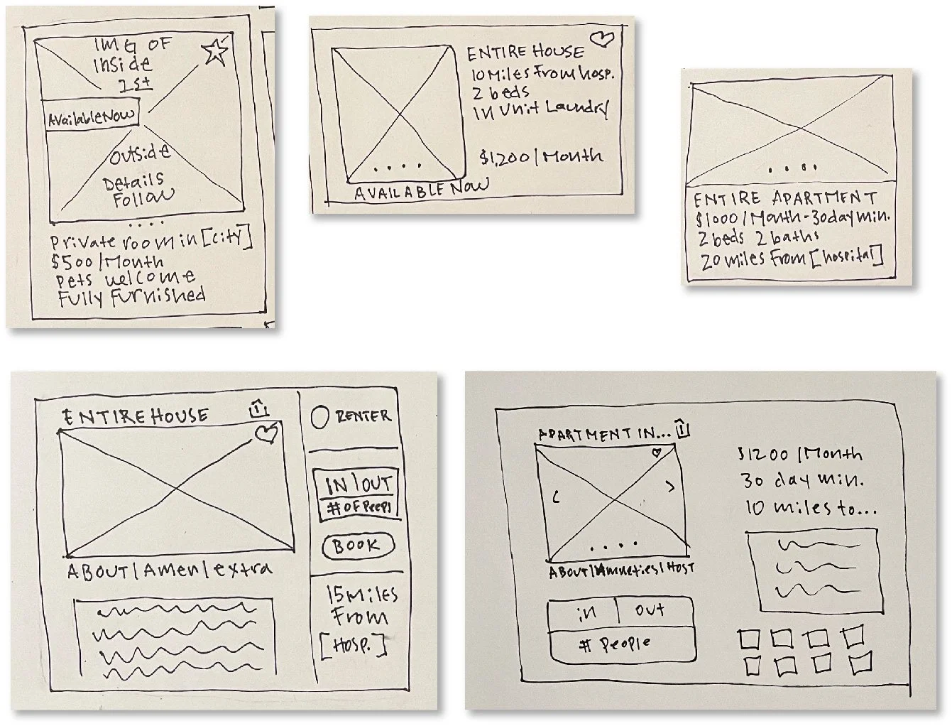
SKETCHES
Phase: Prototype
I translated the “renter user flow” into hand sketches, covering each page that would need to go into the prototype. I collaborated with a teammate to discuss overlap between the renter and owner sides of the platform. We discussed how common elements should look as well as what inputs would effect each side of the platform. We agreed that the large and small property cards will be used by both parties and need to be uniform. Only information that is most important to users should go on the small property cards which is the location, price and distance to work.
KANO ANALYSIS
Phase: Identify, Evaluate
After sketching, we identified a dearth of features that could go into each flow. To isolate the most important features, we conducted a Kano Analysis. A survey with sketches of key features was sent to members of the two user groups who would rate each feature according to their personal indifference, desire, delight and must-have qualities.


“Location relative to my place of interest is an important aspect of choosing a place to rent”
“Accountability is important”
“This is important because you may need specific questions answered before agreeing to rent”
The ability to filter by location is a necessary feature but the degree to which users will appreciate is depends on how well the feature performs.
Reviews are an expected feature and like filtering by distance to work, users will enjoy this feature only if it performs in the way they need it to within the platform.
We heard from our interviewees and users who participated in the Kano survey that they need to be able to message the owner and their preference would be that it is in app and very secure.
MID-FIDELITY PROTOTYPE
Phase: Prototype
Wire framing key screens helped us align on a design for the mid-fidelity prototype that we would use for usability testing. The important features and pages we identified for usability testing were the homepage, search results, property page and dashboard. We wanted the users to try to book a property, send a message and check their dashboard to see saved properties.

USABILITY TESTING
Phase: Evaluate
Our goals for usability testing included gaining further insights into the needs of our users, how they interpreted the look and feel, the ease with which they booked a property and if they could easily find the messaging feature. There were five participants for usability testing, I played the role of notetaker for four sessions and moderator for one. Two of the renter group were medical professionals and three were property owners. We wrote two scripts— one for the renter group and one for the owners. See the owner script and the renter script.

“I like seeing that it says “home” really lends itself to feeling safe and home and comfortable and relaxed”
“Am I renting or are these my properties?”
Regarding the owner dashboard:
SYNTHESIS
Phase: Evaluate
We synthesized the findings by way of affinity mapping in Figjam, separating the boards into renter and owner specific categories.
Our renter group gave the prototype an average rating of 7 out of 7 on ease of use. They gave an average of 6.4 out of 7 for having a warm and inviting appearance.
The owner group gave an average rating of 6.8 our of 7 for ease of use and 5.9 for having a warm and inviting appearance.
(the inevitable snag)
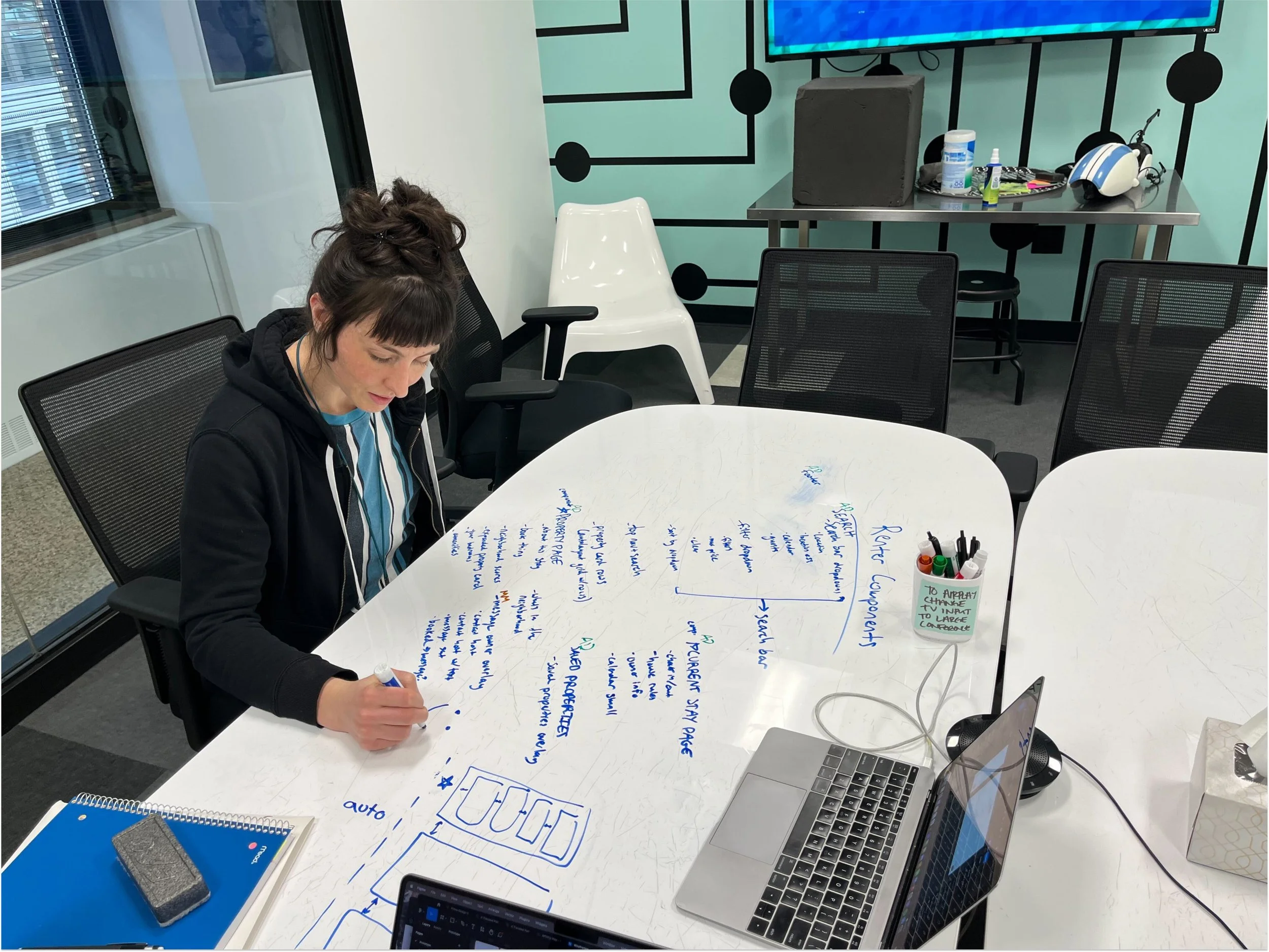
One of the biggest challenges for me during this project was keeping everyone on the same page as we were designing in Figma. Three of us worked on different portions of the prototype, one of whom started on the research side of things and moved to designing after we had already talked about design systems. This resulted in a messy Figma file with multiple versions of pages, overlays and scattershot components on multiple pages.
My colleague and I sat down to figure out what main components we needed to establish before client hand-off and screen by screen, we put everything in place.
In the future, I would spend more time at the beginning of the project nailing down a design system and determine how to communicate changes to the system if they were going to be made mid-project.

Phase: Prototype
HIGH FIDELITY PROTOTYPE
Insights from usability testing and other research informed the renter side of the high-fidelity prototype. The renters we talked to said that they make decisions on where to rent based on a few things: distance to work, mid-term stay lengths, price, full kitchens and onsite laundry. Check out the interactive prototype here.
This information is located prominently on the home page and throughout the website. Each small property card holds only the most relevant information (location, distance to work and price) while the larger property page has more information about the rental.
The traveling medical professionals we interviewed explained that they had a hard time finding the right place because it was difficult to compare properties side by side.
In the prototype, the user has a renter dashboard where they can compare saved properties on medium sized cards that have the property description, key amenities and information about the neighborhood— all things our users told us they needed to see before making a decision.
Messaging and reviews were a top priority for renters. All of the users from usability tests and those represented in the Kano analysis reported that they use reviews to make sure what the owner is selling is accurate. In-platform messaging helps keep personal information safe and conversations with each property owner and rental are all held in one place.

ANNOTATED SCREENS
Phase: Prototype
The traveling nurses we spoke to indicated that seeing pre-filtered properties by distance to their workplace would be a huge time-saver for them and a drop down that allows the user to select the location of their workplace lives on the home page.
The Homepage is an opportunity for A Traveled Path Homes to tell users how they are different from competitors like Airbnb and VRBO.
We heard from all traveling professionals that fully furnished spaces, full kitchens and having a washer and dryer on site were necessities. We suggest that these be requirements for property owners who use A Traveled Path Homes to list their openings.
Both traveling professional and owner user groups expressed a need to see reviews of the company they are using before booking or listing properties.
This is a scrolling list of filter options and more can be added as needed. The filter set has the option to filter by distance to work which is a feature that sets A Traveled Path apart from competitors.
Due to how important reviews are to traveling professionals, we suggest listing property reviews at the top and to the left of the page.
Messaging is a must have feature for all of the users we asked. We gave the users the ability to message from the property page because the information they might have questions about is also on this page.
Amenity descriptions are an addition we made due to what we heard from our property owner group. They indicated that renters ask questions about amenity specifics if the information is easy to locate.
A top priority for traveling professionals is to know a little bit about the neighborhood they will be staying in. This is only one way we came up with to give the users more context as to what the neighborhood might be like.
Users wanted to know where properties were in relation to essential services like grocery stores, shopping centers and restaurants. The map allows the user to click on the location icons to find more information about the store or restaurant.
SUMMARY
This project taught me a lot about designing as a team. It was great to have all hands on deck in the research phase. We all pulled out unique insights that contributed to the outcome of the prototype. We struggled in the visual design process because we didn’t have clear rules set out at the beginning about what our design system would be. One team member came into the design phase later and missed discussions about uniformity. In the future, I would take more time in the beginning of a project to nail down the design system.
NEXT STEPS
We would coordinate with developers and engineers to scope out the creation of a live platform
We would also scope for the design of a mobile platform/app to streamline the use of A Traveled Path Homes’ services.
Lastly, we would develop additional features, such as 3D Property walkthroughs, after the development of the live service.